


The Stendig Calendar: Why a 1966 Design Still Belongs on Your 2027 Wall
There are objects that organise time, and there are objects that change your relationship with it. The Stendig Calendar belongs to the second category. Designed in 1966 by Massimo Vignelli for the New York furniture company Stendig, it has never been discontinued, never been substantially redesigned, and never stopped selling. In a world of disposable design and annual refresh cycles, that kind of longevity is not an accident. It is the result of getting something profoundly right.
Who Was Massimo Vignelli, and Why Does It Matter?

To understand the calendar, it helps to understand the mind behind it. Massimo Vignelli was one of the most consequential graphic designers of the twentieth century. His work includes the New York City subway map and signage system, the American Airlines identity, the Knoll furniture catalogues, and a vast body of typographic work rooted in the belief that clarity is a form of beauty.
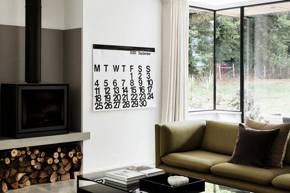
Vignelli was famously opinionated about typefaces. He worked with a small, deliberate selection for his entire career, and Helvetica was among the ones he considered genuinely resolved. The Stendig uses Helvetica in the most stripped-back way imaginable: large, black numerals on a white ground, grid-structured, with no decorative flourish whatsoever. It is design as an argument. The argument is that a calendar does not need to be anything other than a calendar, and that doing one thing extraordinarily well is more interesting than doing many things adequately.
In a cultural moment where maximalism and digital saturation compete for attention, that argument lands differently than it did in 1966. It lands harder.
The Scale Changes Everything

One of the calendar's most discussed qualities is its size. At roughly 122 centimetres wide and 92 centimetres tall, it commands a wall rather than decorating it. Each month becomes a statement piece. The numerals are large enough to read from across a room. The white space is generous. There is nothing to distract from the information being communicated.
This scale is not an aesthetic flourish. It is a functional decision that happens to produce a powerful visual effect. When something is large enough to be legible from a distance, it changes how you interact with it. You do not have to move towards the Stendig to check a date. You glance up. The calendar becomes part of your peripheral awareness, integrated into your sense of the room and the month rather than consulted as a separate task.
For anyone who has felt the disconnection of managing time entirely through a phone screen, this matters. There is something steadying about a physical calendar that is simply present in the room with you, marking the passing of weeks in a way you can see without unlocking anything.
Modernism as a Living Practice

The Stendig is often described as a collector's object, a design icon, something for people who know about these things. That framing undersells it. It is, first and foremost, a remarkably good calendar. It functions beautifully. It tells you what day it is, what week you are in, and how much of the month remains, with no friction and no interpretation required.
But it is also true that living with a Stendig is a small act of alignment with a particular set of values: that considered design improves everyday life, that restraint is not deprivation, that the things we choose to surround ourselves with reflect and reinforce how we want to move through the world. Our homewares and decor collection is built on exactly this principle. The Stendig belongs here.
Where It Lives Best

The Stendig Calendar rewards a wall with space around it. It does not need company, though it takes it well. In a home office, it creates focus without austerity. In a kitchen, it brings an unexpected graphic confidence to a space that often defaults to sentiment. In a hallway, it becomes the first thing you register when you arrive home and the last thing you see when you leave.
Styling it is a study in restraint. The calendar is already doing considerable work on the wall. What sits nearby should not compete. It pairs particularly well with our wall clocks, another design lineage rooted in the idea that time-keeping objects can be beautiful without being decorative. A Stendig and a good clock on the same wall has a gallery-like quality that requires very little else.
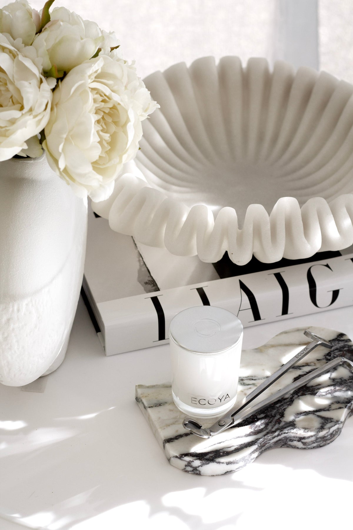
Beyond clocks, consider what you place on the surface beneath or adjacent to the calendar. A stack of well-chosen books. A ceramic or two. A small plant with architectural structure. Nothing that shouts.
The Stendig and the Practice of Intentional Planning

A calendar this present in a room tends to change your relationship with planning. When the month is visible and large, it is harder to let weeks dissolve into each other without intention. The Stendig creates a kind of quiet accountability: you can see where you are, and you can see what is coming.
Plenty of people pair the Stendig with a desk planner or journal for the detail work. There is a clear logic to this pairing: the wall calendar holds the shape of the month, and the written planner holds the texture of each day. Our planners and journals collection includes options well suited to this kind of layered planning, from structured daily layouts to more open formats.
Together, they form a system that keeps you oriented without overwhelming you. This is, at its core, what good design is supposed to do.
A Gift That Stays on the Wall All Year

For those looking for gifts that last and feel considered, the Stendig presents a compelling case. Unlike most objects, it will be used every single day for twelve months. It is functional in the most sustained way a gift can be. And because it is design with a story behind it, it tends to prompt conversation.
It works particularly well for people who are difficult to buy for: those who have good taste, prefer things that do rather than things that sit, and respond to objects with intention behind them. If you are building a gift from this angle, our gift ideas for the minimalist draws together a considered selection with a similar spirit. The Stendig pairs beautifully with a quality journal, a simple desk object, or something from our fragrance range, for a gift that addresses both how a space looks and how it feels.
Why the Stendig Still Feels Contemporary

There is a version of this conversation that leads to nostalgia: a celebration of mid-century design, a lament for a time when things were made to last. But the Stendig does not actually belong to the past. It belongs to now.
The aesthetic it embodies, Helvetica, grid, white space and functional restraint, is not retro. It is the foundation of much of what we consider good design today: minimal interfaces, quiet luxury interiors, the move away from visual noise towards clarity. The Stendig was ahead of the conversation it is now squarely part of.
Sixty years on, a calendar designed by a man who cared deeply about the relationship between form and function still sells, still hangs on walls in homes and studios around the world, and still prompts the same response in people who encounter it for the first time: something like recognition. An immediate sense that this is what it was always supposed to look like.
That is rare. That is worth paying attention to.

The Stendig Calendar is available now at Flux Boutique. Explore our full homewares and decor collection to find the pieces that belong in your home.
Related: How to Choose and Hang a Wall Clock: Size, Height and Where It Works


Leave a comment
This site is protected by hCaptcha and the hCaptcha Privacy Policy and Terms of Service apply.