
Your Brain on Beige: The Power of Soft Neutrals in a Loud World
Not boring. Not blank. Just calm, grounded, and quietly powerful.
In a world of bold choices, soft neutrals often get overlooked. Beige, taupe, sand, bone—they’re too often labelled as safe, bland, or uninspired. But there’s a quiet psychology at play behind these muted tones, and it goes far deeper than aesthetic preference.

Soft neutrals regulate the nervous system.
They calm the senses. They reduce visual noise. They give your brain a place to rest.
When used intentionally, a neutral palette isn’t boring—it’s a balm.
If you’ve ever walked into a room that made your whole body soften, chances are the colour story was working behind the scenes.
Explore more about how your environment affects your nervous system in Designing a Home That Supports the Nervous System.
 The Neuroscience of Neutral Tones
Our brains are constantly scanning our environment for input. Bold, saturated colours stimulate. Loud patterns activate. That’s not inherently bad—but over time, it can overwhelm.
Soft neutrals—like bone, clay, and flax—do the opposite.
They reduce overstimulation.
They allow the parasympathetic nervous system (your “rest and digest” mode) to activate.
They help the body release tension without demanding attention.
This is why a beige-toned room can feel like an exhale.
It’s not just design. It’s biology.
Colour as a Regulating Tool
In a soft neutral space, there’s space to breathe—not just physically, but mentally.
Neutrals that soothe include:
-
Ivory, snow, and flax for brightness without harshness
-
Mushroom, oatmeal, and taupe for grounding
-
Dusty rose, sage, and stone for emotional warmth
-
Charcoal, deep beige, or soft black as calming anchors
Layering these colours creates subtle variation, which the brain interprets as depth—not distraction.
Explore how these tones integrate into your home in Soft Minimalism: A Visual Guide to Calm, Clutter-Free Living.
 Why Bold Isn’t Always Better
Vibrant, high-contrast spaces can be energising—but they can also be overstimulating, especially for neurodivergent individuals or anyone living with anxiety.
In contrast, soft neutral spaces:
-
Reduce cognitive fatigue
-
Encourage relaxation and presence
-
Support emotional processing
-
Help children (and adults) regulate overstimulated nervous systems
This is especially powerful in bedrooms, reading nooks, or any room designed for restoration.
 Emotional Resonance Through Colour
Neutrals carry emotional memory too. They remind us of:
-
Worn pages in well-loved books
-
Sun-bleached wood
-
Linen drying in summer air
-
Sand, stone, soft light, and home
Their beauty is felt more than seen. And their impact is cumulative—especially in homes where wellbeing is part of the design language.
Pair this palette with The Texture Effect: Designing with Emotion Through MaterialsTactile Interiors to add tactile warmth that supports these calming cues.

Stillness, Without Sterility
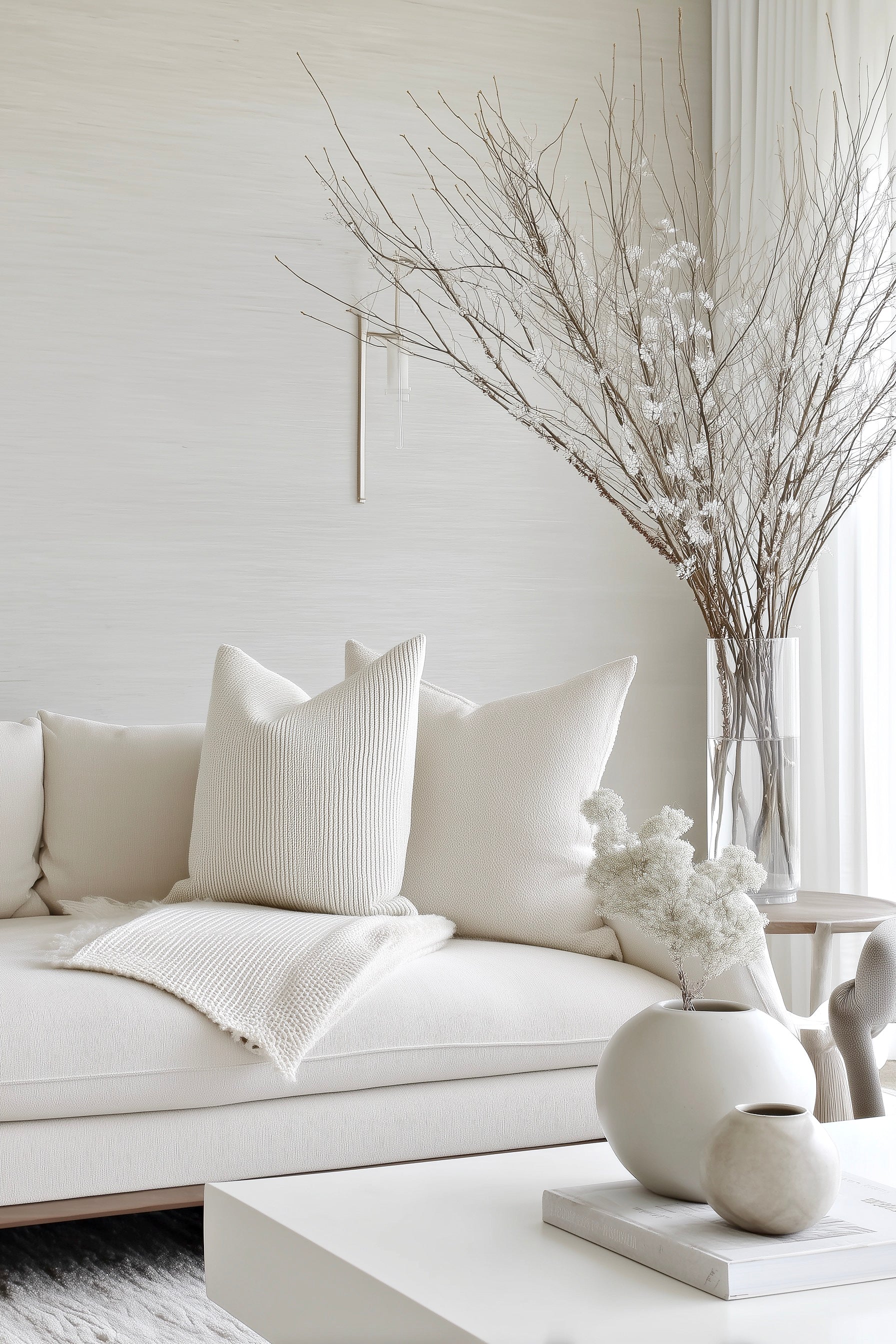
The key to using beige and soft neutrals effectively is depth. A flat white wall can feel cold. But a layered palette of warm ivory, flax, and mushroom—paired with linen, timber, and wool—feels human.
Try this formula:
-
Walls in bone or chalk
-
Textiles in linen, boucle, or raw cotton
-
Furniture in oak, ash, or rattan
-
Accent objects in ceramic, clay, or brushed brass
You’re not avoiding colour. You’re choosing resonance over reaction.

Final Thoughts: Let Beige Be the Background for a Life Well Lived
In a noisy, overstimulating world, soft neutrals offer stillness.
They hold space.
They let your mind rest.
They say: you don’t need to do more—you can just be.
Beige doesn’t demand attention. It gives it back to you.


