


Visual Harmony at Home: Why Balance Feels So Good
Some rooms feel right the moment you walk in, and it is hard to say why. It is almost never one object. It is the way the pale timber repeats from the shelf to the frame, the way a tall stem balances a low bowl, the way the colours sit together without competing. That quality has a name, visual harmony, and it is one of the most useful ideas in styling a home. Here is what it is, why it tends to please us, and how to create it without starting again.

What visual harmony actually is

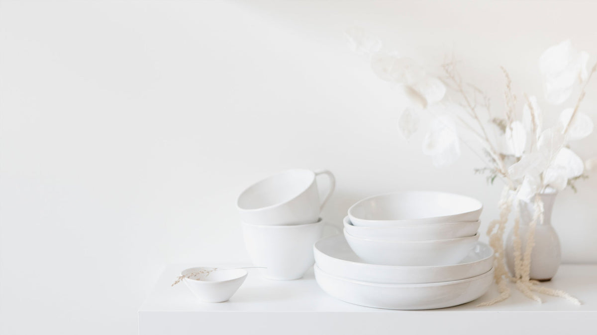
Visual harmony is the sense that the things in a room belong together. It does not require everything to match. A harmonious room usually has three things going for it: a limited palette of colours and materials that repeat, a sense of balance so no corner feels too heavy or too empty, and enough breathing space around objects that each one can be seen. When one of these is missing, a room can feel restless even when every piece in it is lovely on its own.
Why balance tends to feel good

We are cautious about big claims here, because a lot of what is written about beauty and the brain goes well beyond the research. A few ideas are well established, though, and they help explain the feeling.
Psychologists describe processing fluency: things that are easier for us to take in tend to be judged more pleasing. Repetition and order make a scene easier to read at a glance, which may be part of why a coherent room feels restful and a chaotic one feels busy. Studies also consistently find that people tend to prefer symmetry and balance in faces, objects and images, although taste, culture and familiarity shape those preferences a great deal.
Then there is nature. The word biophilia, a love of living things, was first used by the psychologist Erich Fromm. The biologist E.O. Wilson popularised the biophilia hypothesis in his 1984 book of the same name, proposing that humans have an inborn tendency to seek connection with nature. It remains a hypothesis rather than a proven fact, but related research, such as Rachel and Stephen Kaplan's work on how natural scenes let our attention rest, has been influential. Many people find that natural materials and organic shapes make a room feel calmer, and designers have borrowed from that for a long time.
None of this means a beautiful room will fix a hard week. It does suggest that caring how your home looks is not vanity. Most of us simply find ordered, balanced, natural-feeling spaces pleasant to be in.
How to create harmony at home

Choose a short palette and repeat it
Pick two or three colours and two or three materials for a room and let them recur. If there is black in the tapware, echo it in a frame or a vase. If there is warm timber in the floor, pick it up in a tray or a stool. Repetition is what makes separate objects read as a collection. In our coastal homes that often means sand, white and a soft olive green, with timber, linen and stone doing the work.
Balance heavy with light, tall with low
Balance does not have to mean symmetry. A tall branch on one side of a sideboard can be balanced by a stack of books and a low bowl on the other. An olive leaf branch is a favourite of ours for this: at 120cm it gives height and an open, airy line that does not crowd the rest of the surface. Look at a surface from across the room, squint, and ask whether one side feels heavier than the other.
Group objects on a tray

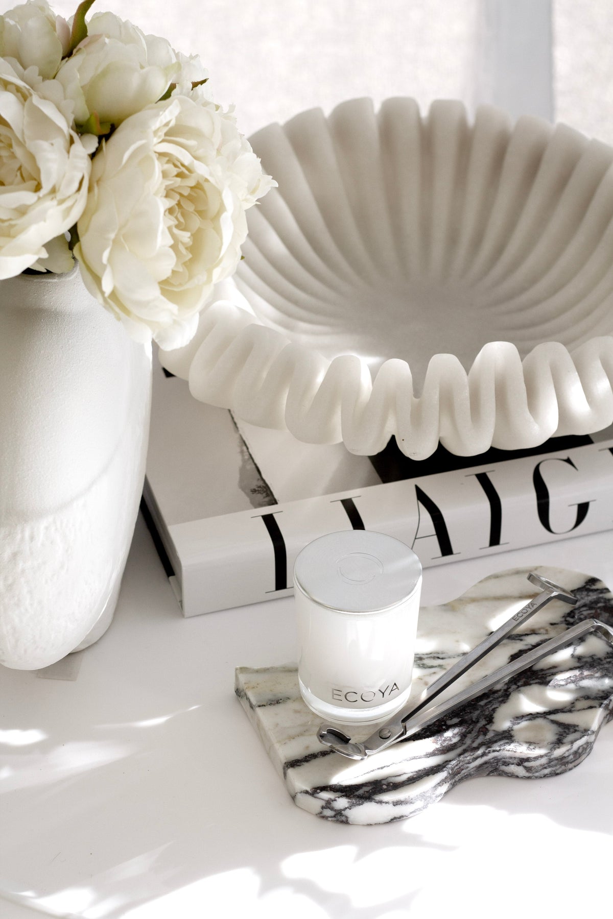
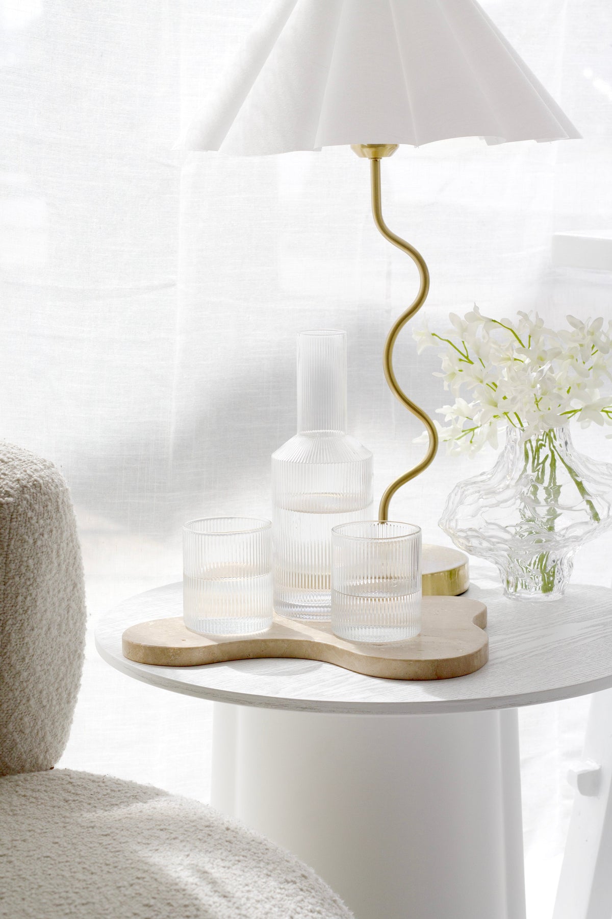
A tray turns scattered objects into a single composition. On a coffee table or bathroom bench, gather the everyday things onto one base and the whole surface looks calmer. The Isobel Travertine Tray works well here because travertine brings natural texture and soft curves while staying quiet in colour.
Leave some space empty
Empty space is what lets the eye rest on the things you have chosen. If a shelf feels busy, take away a third of what is on it and live with it for a week. Most people do not put everything back.
Let imperfect, natural pieces in
Harmony is not the same as perfection. The Japanese idea of wabi-sabi finds beauty in the worn, weathered and handmade, and a room with a few imperfect pieces often feels more settled than one where everything is new. Wabi-Sabi Home by Mark and Sally Bailey is full of homes that do this well, where modest everyday objects are displayed with care.
Keep what means something
What we find beautiful is shaped by memory as much as by line and colour. A bowl from a grandmother or a print from a place you loved belongs in a harmonious room as much as anything bought to match. Give it a clear spot, and let the palette around it be quieter so it stands out. If you would like to go further with a calmer, softer approach, The Soft Minimalist Home by Abi Dare is a practical, warm guide to keeping less without a room feeling bare.
Frequently asked questions
Does a harmonious room have to be neutral?
Not at all. Harmony comes from repetition and balance, not from beige. A room built on deep green and rust can be every bit as harmonious as a white one, as long as those colours recur and nothing fights for attention.
Is there science behind why balanced rooms feel good?
There are well-known findings that people tend to prefer things that are easy to process, and that most of us are drawn to symmetry, balance and natural elements. We would be wary of anything that claims a precise brain effect from a styled room. The research explains a tendency, not a guarantee.
Where should I start?
With one surface. Clear it, choose three objects that share a colour or material, and group them with some space around them. Once one surface feels right, the rest of the room is easier to read.
In essence
Visual harmony is less about buying the right things and more about how the things you have relate to each other. Keep the palette short and repeat it, balance tall with low and heavy with light, leave some space empty, and let natural and meaningful pieces in. Most people find a room like that easier to be in, and that is a good enough reason to care about beauty at home.
For why beauty matters in harder seasons, read Why Beauty Matters More Than Ever at Home.


Leave a comment
This site is protected by hCaptcha and the hCaptcha Privacy Policy and Terms of Service apply.